DEPENDENCY AMONG ECONOMIES, MEASURED BY MAIN STOCK INDICES
Our Projects goal was to Analyze economic dependency among economies by measuring the strength, direction,and relationship between their main stock indices, and how these relationships have changed over timethrough a practical visualization.
Each circle represents a globally listed international index. These indices are representative of economic power of their respective economies and can vary greatly from day to day. The graphic below demonstrates many properties of each of these indices and their relationships on one another.
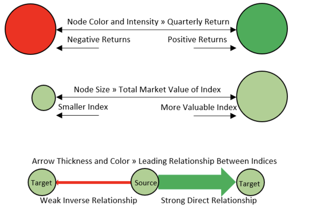
The circle color is representative of the appreciation or devaluation that each index experienced within the given time frame. Closer to white for no changes, darker green for increases in value and darker red to represent decreases in value.
The size of the circle represents the scaled (logarithmic) Market Capitalization of the index. The larger the circle, the more valuable the index. Hovering over each of these circles reveals additional information regarding the specific index.
The arrows from one circle to another represent a one-day lag relationship and vary in thickness to represent the strength of the relationship and in color to represent the direction of the relationship. For example, a thick green arrow from index A to index B would mean that after a change in A is observed, we mathematically conclude that a predictable change in B occurred on the following day. The line color of green shows that index B can be expected to move in the same direction as index A (whether up or down), and the opposite would be true were the line red. The thicker the arrow, the more we expect the target index to move in proportion to the source index.
Model Date
P Values
Indices
Data & Visual Analytics Team 134